Your living room wall is the backdrop to almost everything. Birthday photos, holiday dinners, slow Sunday afternoons. It is also the first thing guests notice once they sit down.
Which is why a blank one keeps nagging at you.
The good part is that filling it takes no designer and no big budget. It takes one choice you feel good about, then the next one.
So this guide gathers 32 wall decor ideas for living room walls, across every direction you might go. The styles trending through 2026. Gallery walls and how the frames actually get arranged. Large statement art for that one wall you keep walking past. Simple ideas that cost very little. And the placement details nobody tells you, like what size to buy and how high it should sit.
Some of these are a single print above the sofa, hung in ten minutes. Others turn into a full gallery wall over a weekend. Both are here, so start wherever your wall is right now.

Living Room Wall Decor Trends for 2026
The cold, empty, all-white look is over. 2026 interiors are warmer, more textured, and far more personal.
Oversized art is replacing scattered small pieces. One confident piece beats seven tiny frames. Designers are sizing art to the furniture, not to the leftover wall space.
Gallery walls are curated, not crowded. Salon-style layouts are still strong. The difference is editing. Five considered pieces with breathing room, not fifteen crammed together.
Warm grounded color is leading, with jewel tones close behind. The 2026 Colors of the Year make this clear. Pantone named Cloud Dancer, a soft luminous white. Sherwin-Williams and HGTV Home jointly chose Universal Khaki, a warm mid-tone neutral, while Benjamin Moore picked Silhouette, an espresso brown with charcoal notes. Behr went emerald green, and Little Greene chose a deep aubergine plum.
Read that list again and the pattern shows up. Soft neutrals as the base. Deep, saturated color as the accent. Sage, olive and terracotta have not gone anywhere, but they are now the familiar option rather than the new one.
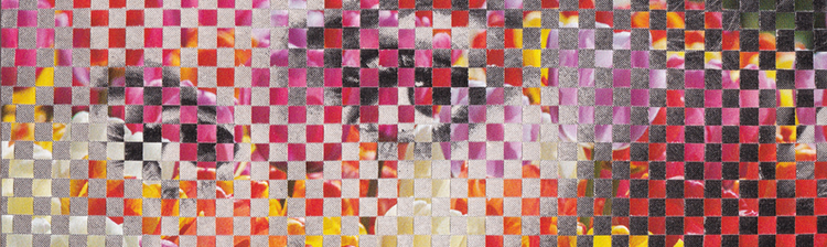
Texture is beating flat print. Woven paper, plaster, wood, metal, hand-worked surfaces. Anything that catches light and casts a small shadow.
Personal is beating mass-produced. This is the biggest shift. Buyers want art with a story behind it, not something that ships by the ten thousand. Knowing who made the piece and why has become part of the appeal.
Object-led walls keep growing. Plates, baskets, hats, textiles, small collections. A trend that started around 2025 and is still building.
What's Out for 2026
-
Flat, mass-produced word art. "Live Laugh Love" is done.
-
Tiny orphaned prints floating on huge walls.
-
Perfectly matched frame sets with zero personality.
-
Cold gray-on-gray minimalism.
-
Gallery walls packed edge to edge with no negative space.
-
Art hung too high, which is still the single most common mistake.

Living Room Art Ideas (Gallery Walls and Picture Arrangements)
A gallery wall is not a random collection. It is one composition made of several parts. Here are six arrangements that work.
1. The mixed-size gallery wall. Pick one larger anchor piece slightly off-center. Build smaller frames around it. Mix frame finishes on purpose, oak with black, thin with wide. Keep the color palette consistent so the mix reads intentional.
2. Salon-style staggered. Frames of many sizes at uneven heights, filling a loose rectangle. It looks casual and takes the most planning. Keep the outer edges of the group roughly aligned and the inside can be free.
3. The symmetrical grid. Identical frames in even rows and columns. Calm, architectural, and very forgiving. Ideal above a sofa or in a hallway you walk past daily.
4. The square grid. Four or nine square prints in matching frames. Squares create a cleaner grid than rectangles because the spacing reads the same in both directions. Pieces like The View Is Better From The Top come in 12x12 and work well here.
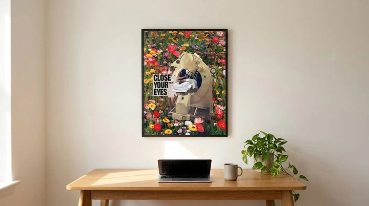
5. Mixed mediums in one group. Photography, painting, and collage together. The rule is one shared thread. Same palette, same mood, or same frame. Mixing analog collage with floral pieces works because the paper texture ties them together.
6. Two rows stacked above a long sofa. Three frames on top, three below. This fills a wide wall with height as well as width, which a single row cannot do.
Spacing and height, the part most people get wrong. Home Depot's picture-hanging guide sets the standard designers use. Hang art so the center sits 57 inches from the floor, which is average eye level. Above a sofa, leave 8 to 10 inches between the furniture and the bottom of the frame.
For spacing between frames, use 2 to 3 inches for tight groupings and 3 to 4 inches for mixed sizes. Keep it consistent across the whole group. Treat a gallery wall as one single piece and center the entire arrangement at 57 inches, not each frame individually.

Modern and Large Wall Art Ideas for Living Room
Big walls need scale, not more pieces. Here is how to get there.
7. One oversized piece above the sofa. Abstract works best because it holds the wall without competing with the room. Hang it low, closer to the sofa than the ceiling.
8. A multi-print grouping that reads as one large piece. This is the practical route to statement scale. Three matching frames, spaced evenly, tight together. From across the room the eye sees one wide artwork.
9. A diptych. Two pieces that pair, either a matched set or two prints in conversation. Great for wide walls where a single piece would look stranded.
10. A triptych. Three panels with even gaps. The most reliable way to cover a wide horizontal wall.
11. A full-wall mural or fabric panel. Best for double-height walls and stair walls, where framed art disappears. This is a bigger commitment and usually a specialist purchase.
12. Sculptural 3D wall art. Metal, carved wood, or plaster relief. It casts shadows that shift through the day, which flat print cannot do.
13. An oversized statement mirror instead of art. An arched or vintage-framed mirror bounces light and makes a small room read larger. It is the best move on a wall opposite a window.
The sizing rule, with real numbers
Art above furniture should span roughly two-thirds to three-quarters of the furniture's width. That is the working range designers use, and it is the single fastest way to stop a wall looking undersized.
A standard 90-inch sofa therefore wants about 60 to 66 inches of art. Almost nobody buys that wide in one piece, which is exactly why groupings win. Here is the math done for you, using framed sizes and 3-inch gaps.
|
Furniture width |
Target art span |
Combination that fits |
Span you get |
|
48 to 54 in console |
32 to 40 in |
Two 11x14 prints in 16x20 frames |
35 in |
|
60 to 66 in loveseat |
40 to 48 in |
Two 16x20 prints in 20x24 frames |
43 in |
|
72 to 80 in sofa |
48 to 60 in |
Three 11x14 prints in 16x20 frames |
54 in |
|
84 to 90 in sofa |
56 to 66 in |
Two 22x28 prints in 26x32 frames |
55 in |
|
96 to 108 in sectional |
64 to 80 in |
Six 16x20 prints, two rows of three |
66 in wide |
One thing that trips people up. A print and its frame are not the same size, because most fine art prints ship with a white border built in. An 8x10 print usually needs an 11x14 frame. Always buy the frame for the full sheet size, not the printed area. The size guide lists sheet dimensions and matching frame sizes for every format, which saves a return.
Simple and Budget Friendly Wall Decor Ideas
Good walls are not expensive walls. They are decided walls.
14. One statement print and nothing else. The cheapest high-impact move there is. Pick a piece with strong color or a clear focal point and let the wall stay quiet around it. Something like Flowerscape at $22 carries a small wall on its own.
15. A picture ledge. One shelf, several leaning pieces, two screws total. You can restyle it in a minute and swap art with the seasons without touching the wall again.
16. Art leaned against the wall on the floor. Behind a plant, next to a console, propped on a credenza. Casual, renter-safe, zero holes.
17. Peel-and-stick or removable prints. Useful in rentals and for renters who move often. Test on a small patch first, since some wall paints lift.
18. A framed textile or tapestry. Fabric brings softness that glass and paper cannot. It also quietly absorbs echo in hard-surfaced rooms.
19. A woven basket cluster. Three to five flat baskets in varying sizes and tones. Texture, warmth, and almost no weight.
20. Thrifted and vintage finds. Old landscape paintings, secondhand mirrors, estate sale frames. This is where genuinely one-of-a-kind pieces live, and they cost less than new decor.

What a full wall actually costs
Useful to know before you start, because most guides skip it.
-
One statement print: from $22, plus one frame.
-
A three-print grouping: roughly $66 to $99 in prints, plus three frames.
-
A six-print grid: roughly $132 to $198 in prints, plus six frames.
Sticking to standard sizes like 8x10, 11x14 and 16x20 keeps framing cheap, because off-the-shelf frames fit them. Custom framing is where budgets quietly double.
One note on restraint. Simple does not mean sparse. Empty wall around a piece is what makes the piece read as art rather than filler. Leaving space is a choice, not a gap you failed to fill.
Wall Decor Ideas by Focal Point
Every living room has three or four walls and only one of them is the problem. Find yours below.
21. Above the sofa. The most searched wall in the house, and the one with the clearest rules. Use the two-thirds span, hang 8 to 10 inches above the back cushions, and center the group at 57 inches. Landscape and horizon pieces suit this wall because the shape matches the sofa. Against All Odds and Worth The Trip both work in a pair or a trio.
22. Above the fireplace or mantel. One piece, sized to the firebox rather than the whole chimney breast. Lean it on the mantel instead of hanging if you want to change it often.
23. The TV wall. The goal is stopping the screen from being the only thing on the wall. Flank the TV with two vertical prints, or run a picture ledge below it. Painting the wall a deeper shade also helps the screen recede when it is off.
24. An empty corner vignette. Pair a console or bar cart with one piece above and one leaning behind. Corners are where a room starts feeling finished rather than furnished.
25. Built-in shelving or a bookcase wall. Lean small prints among the books, or hang one piece directly over the shelf front. It breaks up the horizontal lines and stops a bookcase reading as storage.
26. An accent wall with one bold piece. Paint or panel one wall, then hang a single high-contrast artwork. Black and white pieces such as Collective Dream read cleanly against a saturated color.

Textural and Functional Wall Decor
Framed art is one layer. These are the others, and they are what separates a styled wall from a decorated one.
27. Wall sconces. Decor that also lights the room. A pair flanking art turns a flat wall into a composition and lets you skip a table lamp. Plug-in versions exist for rentals.
28. Decorative mirrors. One large statement mirror, or a staggered pair at slightly different heights. Mirrors do double duty by adding light as well as shape.
29. Wall-mounted shelving. Two or three floating shelves styled with plants, books, and small objects. Rotate what is on them and the wall never feels static.
30. Wall plates and object collections. Ceramic plates, hats, vintage tools, small textiles. Group in odd numbers and keep one material or color running through the set.
31. Wood slat or vertical panel backdrop. Vertical slats behind a sofa add warmth and linear texture. They also improve how a room sounds, which matters in open-plan spaces.
32. Board and batten as a backdrop. Paint it the same color as the wall and it becomes quiet architecture. Art hung on top of it reads as deliberate rather than dropped on.

How to Choose and Hang Wall Art in a Living Room
Six steps, in order. Follow them and you will not need to patch the wall.
Step 1. Pick your focal wall and your anchor piece. One wall gets the attention, usually the one facing the door or behind the sofa. Choose your largest or boldest piece first and build everything else around it.
Step 2. Size it before you shop. Measure the furniture width and multiply by two-thirds. That number is your target art span. Use the table above to find the print combination that hits it.
Step 3. Group in odd numbers. Three, five, or seven pieces. Odd groupings feel more natural because the eye cannot split them into matching halves, so it keeps moving across the arrangement instead of stopping in the middle. Even numbers read formal and staged, which is fine for a symmetrical grid and wrong for everything else.
Step 4. Hang at eye level. Center of the piece or the whole group at 57 to 60 inches from the floor. Above furniture, keep 8 to 10 inches of gap. If the room is mainly used seated, drop toward the lower end of the range.
Step 5. Mix mediums and textures instead of matching everything. One woven piece among framed prints. One wide oak frame among thin black ones. Matching sets are the fastest way to make a wall look bought rather than collected. Pulling from a couple of different collections rather than one set does this naturally.
Step 6. Do the paper test, then edit. Trace each frame onto kraft paper or newspaper. Cut out the shapes and tape them to the wall. Live with the layout for a day before you pick up a drill. Then step back, remove one piece, and see if the wall improves. It often does.
Frequently Asked Questions
What color is in for living rooms in 2026?
Warm neutrals as the base, deep saturated shades as the accent. Pantone chose Cloud Dancer, a soft white. Sherwin-Williams and HGTV Home named Universal Khaki, a warm mid-tone tan. Benjamin Moore picked Silhouette, an espresso brown with charcoal notes. Behr went emerald green and Little Greene chose deep aubergine. Sage and olive remain safe and current.
What is the 3-5-7 rule in decorating?
It means grouping decor in odd numbers, usually threes, fives, or sevens. Small objects work in threes. Medium pieces like vases and books suit fives. Larger items such as gallery wall prints or pillows can go to seven. Odd groupings look collected rather than staged, because the eye cannot split them into equal halves.
What color makes a house look expensive?
Deep, saturated, warm tones in a matte finish. Zillow's 2026 paint research found buyers valued charcoal gray living rooms $1,509 more than white ones, and pale blue $1,723 more. The expensive look comes from depth and consistency, not brightness. Matching your art palette to the wall color amplifies the effect.
What color mistakes should I avoid in my living room?
Three big ones. Stark builder white with tiny art on it, which makes walls feel unfinished. High-gloss paint on large walls, which shows every flaw. And clashing undertones, like a cool gray wall against warm beige furniture. Test paint on the actual wall and look at it in evening light before committing.
What colors decrease your home's value?
Zillow's 2026 analysis found ochre yellow used throughout a home can cut its value by $18,164. Pale pink ranked in the bottom three for every room, costing sellers an estimated $6,013 in a bathroom. Fire-hydrant red bathrooms fared badly too. Sage green was the only color in the top tier across every room.
What is the latest trend for wall decor?
Fewer, larger, more personal pieces. Oversized statement art is replacing clusters of small frames. Gallery walls are being edited down and given breathing room. Texture is beating flat print, so woven paper, plaster, wood and metal are rising. And mass-produced decor is losing to art with an actual maker behind it.
What size should wall art be above a sofa?
Aim for two-thirds to three-quarters of the sofa's width. A 90-inch sofa wants roughly 60 to 66 inches of art. Hang the bottom edge 8 to 10 inches above the back cushions and center the piece or group at 57 inches from the floor. Most people reach that width with two or three framed pieces rather than one.