Your bedroom is the only room you see with your eyes half closed. It is the last wall you look at each night and the first one each morning.
Which is why picking wall art for a bedroom is worth a little more thought than picking a cushion. Most guides hand you a photo gallery and leave you to guess at scale. This one gives you the measurements too.
Below you will find 30 wall art ideas for bedroom walls, grouped by where they go rather than by mood. We cover what is actually trending in 2026, how to match art to the feeling you want, what belongs above the bed, what belongs on the wall opposite it, how to scale up for a master bedroom, and how to do all of it on a small budget. There is a sizing table by bed size, a short hanging guide, and answers to the questions people ask most.
Bedroom Wall Art Trends for 2026
Two things are happening at once, and they sound contradictory until you look closer.
Calm is winning, but calm is not the same as colourless
The move toward restful bedroom art is real. People are choosing softer subjects and lower contrast than they were five years ago. Muted blues, dusty greens, warm sand tones and clay pinks are everywhere.
There is a reason this works. The Sleep Foundation notes that blue is widely associated with calmness and relaxation, making it one of the better choices for a bedroom.
But here is what most trend roundups get wrong. What disturbs a bedroom is rarely colour itself. It is contrast, busyness and clutter. A deep saturated print in a quiet room can feel more restful than five pale prints fighting for attention.
So the useful version of this trend is not "buy beige." It is: pick fewer pieces, give them room, and keep the contrast soft.
Original work is replacing matched sets
The second shift is a reaction against the showroom look. Buyers are moving away from mass produced prints sold in matching threes, toward work that has a hand behind it.
The market data supports this. Fortune Business Insights reports that North America accounted for $29.16 billion of the global wall art market in 2025, around 43.6% of the total, driven partly by demand for artisan made home decor.
In practice this means one piece you actually love, rather than three that merely coordinate.
Texture is treated as a colour
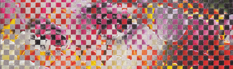
Woven pieces, tapestries, paper collage and mixed media are being used the way colour used to be used. A textured surface adds interest without adding contrast, which is exactly what a bedroom wants. Collage work sits neatly here, since the visible paper grain does the job that a bold colour would otherwise have to do. The Weaving collection is a good example of texture carrying a piece.
Gallery walls got smaller
Gallery walls have not gone away. They have just been edited. The 2026 version is three to five pieces with generous gaps, one repeated frame colour, and one shared palette. Nobody is doing the fifteen frame jigsaw above the bed any more.
Nature imagery kept its ground
Botanical prints, coastal photography and wide landscapes remain the safest bedroom choice, and the most popular. Soft horizons and organic shapes read as restful from across a room. The Nature collection leans this way without going literal.
Soft curves replaced hard geometry
Abstract art is still selling well in bedrooms, but the shape language has changed. The sharp grids and hard diagonals of a few years ago have given way to curves, arcs and layered washes. A rounded form has no edge for the eye to catch on, which is why it settles a room that geometry would sharpen.

What's Out for Bedroom Walls in 2026
Four things are aging badly.
Perfectly matched art sets: Three prints from the same product page, same size, same frame, evenly spaced. It reads as a hotel corridor.
High contrast graphics above the bed: Sharp black and white geometry looks great in a hallway. Above a headboard it fights the room.
Generic motivational text: "Live Laugh Love" and its descendants. A handwritten piece that means something to you is a different thing entirely.
Filling every wall: An empty wall is not an unfinished wall. It is often the reason the finished wall works.
How to Choose the Right Mood and Style for Your Bedroom Wall Art
Most people start by browsing styles. That is backwards, and it is why so many bedrooms end up with art that technically matches but never settles.
Start with the feeling instead. Ask one question: what should this room do to me when I walk in?
There are really only four common answers.
Calm. You want the room to lower your shoulders. Choose low saturation, soft edges, wide open subjects. Landscapes, misty horizons, quiet botanicals.
Romantic. You want warmth and softness. Choose dusty pinks, clay, rust, warm cream. Florals and figurative work suit this. The Floral collection sits here.
Grounded. You want the room to feel solid and considered. Choose earthy neutrals, natural textures, timber frames, organic form.
Curious. You want the room to feel like yours, not like a rental. Choose work with a story, a strange detail, something you can look at for the hundredth time and still notice. Surrealist work does this well.
Now pick a style direction
Once you know the feeling, the style narrows quickly. Six directions cover most bedrooms.
Quiet minimalism: One or two pieces, plenty of empty wall, low contrast. Line art and single forms. Suits calm, and suits small rooms.
Coastal: Water, sand, wide horizons, pale blues and warm whites. Suits calm, and opens up a room short on light.
Boho: Layered, collected, textural. Woven pieces, warm earth tones, mixed mediums, nothing matched. Suits grounded and curious.
Botanical: Leaves, stems, wildflowers, soft greens. The most forgiving direction, because it works with almost any bedding and any timber.
Moody or romantic: Deeper tones, softer edges, figurative or floral subjects. Dusty pink, clay, rust, deep green. Suits romantic.
Modern abstract: Curved shapes and layered colour with no subject to read. Suits calm if the palette stays soft, and curious if it does not.
Pick one and stay in it. Mixing two directions in one bedroom is where most rooms come apart.
Then let placement decide intensity
This is the part almost every guide misses, and it solves the biggest argument in bedroom decorating.
You never actually look at the wall above your bed while you are in the bed. You see it from the doorway, standing up, on your way in or out. That wall can carry more colour and more personality than people assume.
The wall opposite the bed is different. That is the one you stare at while your alarm goes off. That is where restfulness genuinely matters.
So a bold, saturated, characterful piece belongs above the bed. A quiet one belongs opposite it. Not the other way around, which is how most rooms get it.
Personal meaning outranks style matching
A print of a place you have actually been will hold your attention longer than a stylistically perfect abstract. Travel photography, a landscape from somewhere that matters, a piece bought on a trip. These age better than trends do.
If you know the person who made the work, better still. Rafael's studio process and story is part of why a collage piece reads differently from a stock print on the same wall.
Wall Art Ideas Above the Bed
This is the wall everyone searches for, and the one people get wrong most often. Eight approaches, from simplest to most involved.
1. One large statement piece: The default for a reason. A single print centred above the headboard anchors the bed and finishes the room in one move. Go as large as the wall allows. This is the one place where too small is a much bigger risk than too large.
2. A symmetrical pair: Two prints of the same size, side by side, with an even gap. Calmer than one big piece, and easier to get right on a wide wall. Keep the palette shared and the frames identical.
3. A row of three: Three smaller prints in a line, evenly spaced. This spreads across a king or California king wall without needing an oversized single piece. It also lets you mix subjects while keeping one visual thread.
4. A restrained gallery wall: Three to five pieces, mixed sizes, one repeated frame colour, generous gaps. Works best when the tallest piece sits roughly centred and the smaller ones fill outward.
5. Asymmetrical, weighted to one side: One tall portrait print above a single nightstand, balanced on the other side by a lamp, a plant or a stack of books. More modern than symmetry, and useful when a window or a door eats into the wall.
6. Leaning on a ledge: A slim picture ledge above the headboard, with art propped rather than hung. Layer a larger piece behind a smaller one. This is the easiest arrangement to change your mind about.
7. Square format on a headboard free wall: If there is no headboard, a square print reads as more deliberate than a portrait one. It sits in the visual gap where a headboard would have been.
8. One print, oversized mat: A generous mat around a small print buys you wall coverage at a fraction of the cost. An 11x14 print in a wide mat can occupy the space of a 22x28.

How to Size and Place Art Above the Bed
Here is the rule everyone quotes: art above a bed should span 60 to 75% of the bed's width.
Here is the part nobody mentions. That rule refers to how much wall the art occupies, not the printed image size. A print has a border. A frame adds moulding. Both count.
A 16x20 print, for example, comes on a 20x24 sheet once the white border is included. Add frame moulding and it occupies roughly 23 inches of wall, not 16. That gap is why so many carefully measured walls still look wrong. Full border and sheet dimensions for every size are on the size guide.
So work from framed width. Here is what actually lands in range:
|
Bed size |
Bed width |
Target art span (60 - 75%) |
Combinations that land in range |
|
Twin |
38 in (97 cm) |
23–29 in (58 - 74 cm) |
One 16x20 (23 in framed) or one 22x28 (29 in framed) |
|
Full |
54 in (137 cm) |
32–41 in (81 - 104 cm) |
One 22x28 landscape (35 in), or two 11x14 with a 2 in gap (34 in) |
|
Queen |
60 in (152 cm) |
36–45 in (91 - 114 cm) |
Two 12x12 squares with a 3 in gap (~37 in), or three 8x10 in a row (43 in) |
|
King |
76 in (193 cm) |
46–57 in (117 - 145 cm) |
Two 16x20 with a 3 in gap (49 in), or three 11x14 in a row (52 in) |
|
Cal King |
72 in (183 cm) |
43–54 in (109 - 137 cm) |
Two 16x20 with a 3 in gap (49 in), or three 11x14 in a row (52 in) |
One honest note. A single print, even at the largest size, tops out around 35 inches of framed width. That covers a twin or a full comfortably. A king wall needs a pair or a trio to reach 46 inches and up. Two prints is not a compromise on a king bed. It is the correct answer.
Height. Hang so the bottom of the frame sits 6 to 10 inches (15 to 25 cm) above the headboard. Closer than that feels cramped. Further and the art drifts loose from the bed.
No headboard? Use the pillow line instead of the floor. Aim for the bottom of the frame to sit about 8 to 12 inches above where your pillows stop.
Test before you drill. Cut paper to the full framed size, including the border. Tape it up. Then look at it three ways: from the doorway, from the foot of the bed, and sitting on the bed. Leave it for a day. Paper is cheap and plaster is not.
Wall Art Ideas for the Wall Opposite the Bed
Nobody plans this wall. Everybody looks at it more than any other wall in the house.
It is the first thing you see when your alarm goes, and the last before the light goes off. If a room feels subtly wrong despite good art above the bed, this wall is usually the reason.
Seven ideas, plus the placement detail that makes them work.
9. A single low hung piece: One print, deliberately hung lower than gallery height. More on why below.
10. A soft horizon: A wide landscape or coastal image. Horizontal lines read as restful, and a distant horizon opens up a small room. Worth The Trip is the kind of quiet wide view that suits this wall.
11. A soft abstract: Curved shapes and layered colour, nothing sharp. Useful here precisely because there is no subject to interpret at 7am. Your eye can rest on it without doing any work.
12. A minimal botanical: A single stem, one leaf, a lot of open space. The quietest option on this list, and the easiest to live with long term.
13. Something that reads as one shape: A test rather than a subject. Squint at the piece from across the room. If it collapses into one simple form, it will feel calm from the bed. If it stays busy when blurred, it belongs on another wall.
14. A travel or memory print: Somewhere you have been, or want to go. This is the wall where personal meaning earns its keep, because you will look at it every single morning. Against All Odds works if you want something with a bit of lift to it.
15. A handwritten or hand lettered piece: Not a mass produced slogan. Something in an actual hand, ideally about something real.
The height rule changes on this wall
Standard advice says centre art at 57 to 60 inches from the floor. That is gallery height, and it assumes a standing viewer.
You are not standing. You are sitting up against a headboard, or lying propped on pillows.
Do the arithmetic. A mattress top sits around 24 inches from the floor. Seated eye height for most adults is around 28 to 30 inches above the surface you are sitting on. So your eye level in bed lands near 52 to 56 inches, not 57 to 60. Propped on pillows it is lower still.
That is a difference of four to eight inches, which is enough to notice every morning. So hang art on this wall a little lower than you would anywhere else in the house.
Better still, measure it. Sit in bed where you actually sit. Have someone mark the wall at your eye line. Centre the art there.
One thing to keep off this wall: anything visually loud, anything cluttered, and anything that reads as a task. No to do lists, no calendars, no dense gallery grids. Save those for the office.

Wall Art Ideas for Master Bedroom
A master bedroom is not a bedroom with more square footage. It is a room with more than one focal point, and the art has to acknowledge that.
16. A pair at the largest size: Two 22x28 prints above a king bed, with a small gap. This is the closest thing to an oversized single piece, and it reads more considered than one stretched canvas.
17. A trio in a row: Three prints of matching size, evenly spaced above the bed. It fills a wide wall without any single piece having to do all the work. Three 11x14s span around 52 inches.
18. A gallery wall above a bench or dresser: Move the arrangement off the bed wall entirely. Five pieces above a bench, tightly grouped, works better than five pieces above a headboard.
19. Art beside a reading chair: One piece at seated eye height next to the chair. It defines the corner as a place rather than leftover floor.
20. The sitting area as a second focal point: If the room has a chair, a bench and a lamp, treat that as its own small wall. Give it one piece, at its own scale, and let it be quieter than the bed wall.
Scale up, but do not cool down
The trap in a large bedroom is formality. Bigger art, more symmetry, more restraint, and suddenly the room feels like a hotel suite that nobody lives in.
Two ways to avoid it. Keep at least one piece that is personal rather than decorative. And let the scale come from grouping rather than from one enormous piece. A trio of prints holds warmth in a way that a single billboard sized canvas rarely does.
Palette also matters more at scale. A large piece in a cold grey will chill a whole room. The same size in a warm tone will not. Collective Dream is a good example of a tonal piece that still reads warm.

Simple and Budget Friendly Bedroom Wall Art Ideas
Good bedroom walls are not expensive. They are edited.
21. One print instead of an arrangement: A single well chosen piece beats a wall of cheap filler every time. Flowerscape starts at $22, which is less than most people spend on a cushion.
22. Lean it on a dresser or shelf: No drilling, no hardware, no commitment. A print propped against the wall on a dresser looks intentional and takes thirty seconds.
23. Framed textiles: A remnant of good fabric, stretched or framed, gives you texture and scale for very little. Vintage scarves work unusually well.
24. Printable art: Buy a digital file, print it at a local shop, frame it yourself. The cheapest route by a wide margin. Two things to check before you commit: the file needs to be at least 300 DPI at your intended print size, and a home inkjet on thin paper will look like what it is. Pay for decent paper at a print shop and the gap narrows a lot.
25. New print, thrifted frame: Frames are where the money goes. A charity shop frame with a fresh print is the highest value swap in the whole exercise. Buy the frame first, then match a print size to it.
26. Thrifted paintings and originals: Worth looking for, with realistic expectations. Charity shops and estate sales do turn up genuine paintings, but it is a slow hunt and you cannot plan a wall around it. Treat it as a bonus rather than a strategy. If you find one, keep the frame and check the back for damp.
27. Removable strips for renters: Adhesive hanging strips handle lightweight framed prints without touching the plaster. Check the weight rating and avoid hanging anything heavy directly above a pillow.
Simple is not the same as sparse. One print on a large wall, with real space around it, is a deliberate choice. Empty wall is a design element, and it is free.
Bedroom Painting and Print Ideas by Theme
Treat this as a menu. Pick one lane and commit, rather than sampling all seven.
28. Botanical and nature: The safest bedroom theme, and still the most popular. It scales in both directions, from one spare stem to a dense wildflower field, so it suits a small room and a large one equally. Soft greens and creams sit well with linen and timber. The View Is Better From The Top is in this space.
29. Coastal and landscape: Wide horizons, water, distant hills. Opens up a boxed in room. Keep contrast low and avoid dramatic weather.
30. Soft abstract: Covered above as an opposite-wall option, but worth a note as a direction in its own right. Abstract is the most forgiving theme to buy blind, because there is no subject to clash with your bedding or your furniture. Judge it on palette and contrast alone. If those two are right, it will work.
31. Minimalist line art: A single continuous line, a simple form. Ideal for small bedrooms, narrow walls and the gaps beside doors. Adds interest without adding weight.
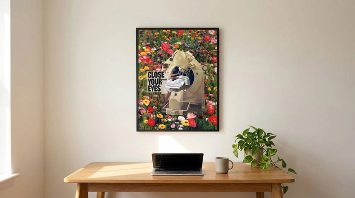
32. Surreal and collage: For bedrooms that should feel like somewhere, not just like a room. Paper texture, unexpected combinations, a detail you keep noticing. Parallels and the wider Analog Collage collection work here.
33. Celestial and space: Night skies, moons, stars. It sounds bold but reads surprisingly calm, because the palette is naturally dark and low contrast. Star Children and the Galactic collection are worth a look.
34. Personal and sentimental: Travel photography, a place that matters, handwriting, a piece you were given. No theme ages better, because it is not a theme.
How to Choose and Hang Bedroom Wall Art
Six steps, in order. Do not skip step one.
Step 1: Decide the feeling first. Calm, romantic, grounded or curious. Everything after this gets easier once you have picked.
Step 2: Pick one focal wall. Above the bed or opposite it. One, not both. The second wall can wait until the first one works.
Step 3: Measure, then apply the 60 to 75% rule. Measure your bed width. Multiply by 0.6 and 0.75. That range is your target framed span, borders and moulding included.
Step 4: Set height against the furniture, not the floor. Above the bed, 6 to 10 inches above the headboard. Opposite the bed, centre it at your seated eye level, usually 52 to 56 inches.
Step 5: If using more than one piece, keep one shared thread. Frame colour, palette, subject or medium. Pick one and repeat it. You can mix everything else.
Step 6: Leave one wall alone. Step back before you add anything more. In a bedroom, the restraint is the style.
Looking After Bedroom Prints
One thing worth knowing, because bedrooms often get the harshest light in the house.
Bedrooms usually face the sunrise, and morning sun hits hard and low. Direct sunlight fades prints, and the damage is permanent.
The Library of Congress preservation guidance recommends keeping framed paper out of direct sunlight, away from radiators, vents and fireplaces, and hung on interior rather than exterior walls. Interior walls hold a steadier temperature and carry less moisture.
Three practical takeaways for a bedroom:
-
Avoid the wall that takes direct morning sun. If that is your only option, ask for UV filtering glazing when you frame.
-
Do not hang prints directly above a radiator.
-
Archival paper and pigment inks matter here. Giclée pigment inks on cotton rag hold colour far longer than dye based poster printing, which is why fine art prints outlast posters on the same wall.
Framing is where most of the protection happens, and the size guide lists the frame size that fits each print with its border.
Frequently Asked Questions
What is the 3-5-7 rule in decorating?
The 3-5-7 rule says to group objects in odd numbers, ideally three, five or seven. Designers use it because odd groupings read as more visually engaging than even ones. Even numbers create instant symmetry that the eye processes and moves past. Odd numbers keep it travelling. On a bedroom gallery wall, three or five prints will usually look more collected than four.
What is the 70/30 rule in art?
The 70/30 rule means roughly 70% of a composition should be one dominant element, with 30% providing contrast. It applies to colour, tone and negative space. When elements split close to 50/50, a piece feels unresolved. For a bedroom, this is useful in reverse: choose art that is 70% quiet with a small area of interest, rather than busy edge to edge.
Can you mix different styles of art in one bedroom?
Yes, and mixed walls usually feel more personal than matched ones. The trick is repeating one element across every piece. Pick a shared frame colour, a shared palette, a shared subject or a shared medium, then vary everything else freely. Botanical next to abstract works fine if both sit in the same tonal range. Without one shared thread it reads as unfinished.
Does the color of bedroom wall art affect sleep quality?
Colour affects how a room feels, which affects how easily you wind down. The Sleep Foundation notes blue and green are commonly associated with calm. But the evidence is about association and mood, not a direct measurable effect on sleep. Saturation and contrast matter more than hue. A soft deep red will feel calmer than a bright pale blue.
Can wall art make a small bedroom feel bigger?
It can, if you choose depth over quantity. One large piece with an open horizon or receding distance pulls the eye past the wall and makes the room read as deeper. Several small pieces do the opposite, because each frame edge marks the wall's real position. In a small bedroom, one big print with space around it beats a gallery wall.